

PranamaYoga
Client: PranamaYoga
2024
Visual identity
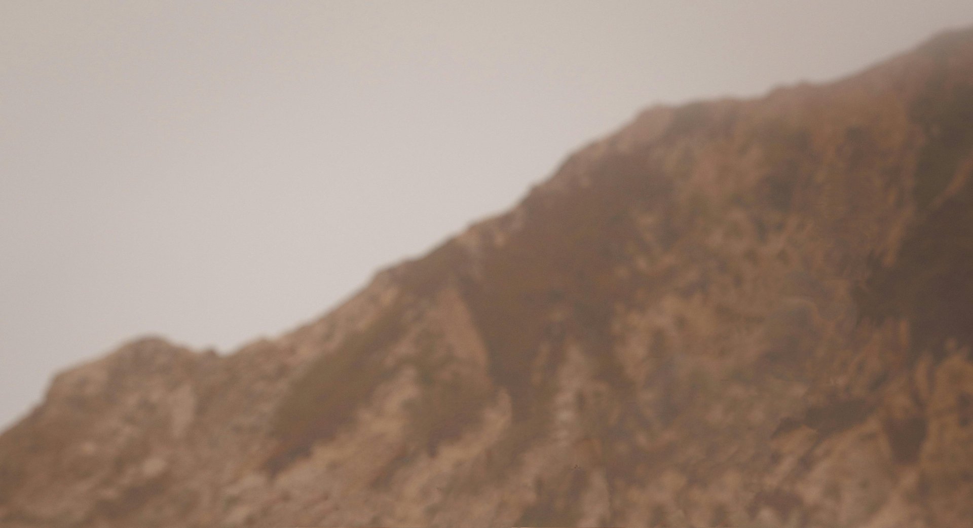
A digital sanctuary to return to the self.
PranamaYoga was born as a space of reconnection — an identity designed not only to represent, but to hold. A visual experience rooted in softness, introspection, and the balance between body, mind, and spirit.


Focus on values and strategy.
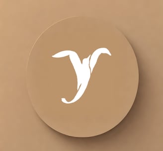
At the heart of the brand lies a symbol: the fusion of a seagull and the letter “Y”.
This wasn’t a graphic whim — it was a way to evoke lightness, expansion, and the inner breath of being.
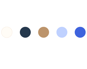
The color palette dances between earthy warmth and airy blues, grounding the spirit while freeing the mind.


Visual serenity as a design goal.
PranamaYoga was designed as a digital sanctuary. A gentle pause for those who seek wellbeing not as performance, but as presence. The identity doesn’t aim to impress — it aims to breathe.
Through clear layouts, calming contrasts, and warm editorial touchpoints, the platform becomes a soft container for clarity, pause, and reconnection.

Ailenadesignspace all rights reserved